Role: Lead Designer
Duration: 3 weeks
Skills: Iteration, Photography, Hands-on Prototyping
PROJECT SUMMARY:
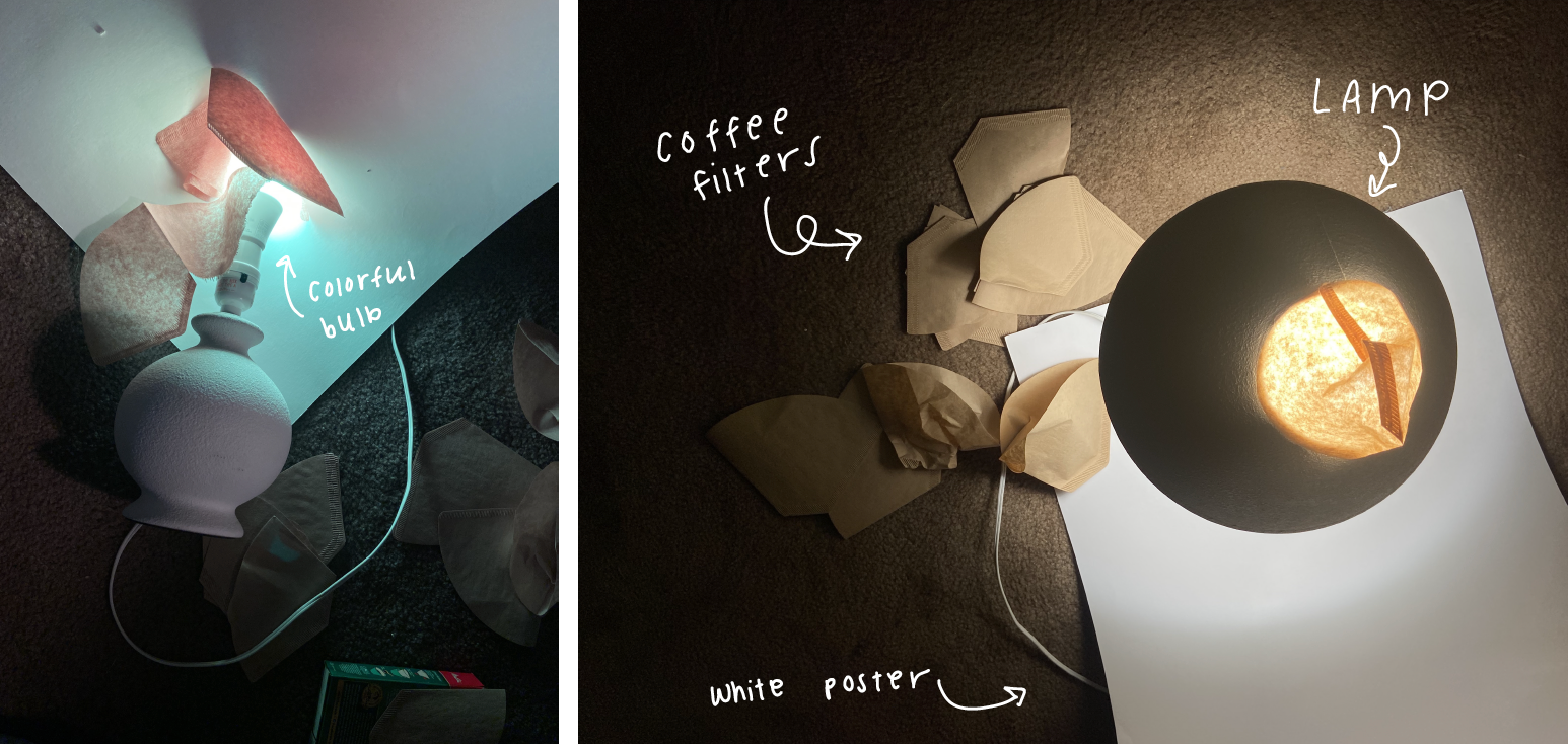
This project involved exploring an everyday object in order to capture its essence, form, and function in a novel way in order to push creativity and unconventional thinking. I chose to explore a coffee filter, as I was intrigued by the way it transforms with use, as well as its plain appearance. With the added constraint of no post-production editing allowed, I experimented with a colored lightbulb, as well as a double-exposure lens in order to achieve interesting results.
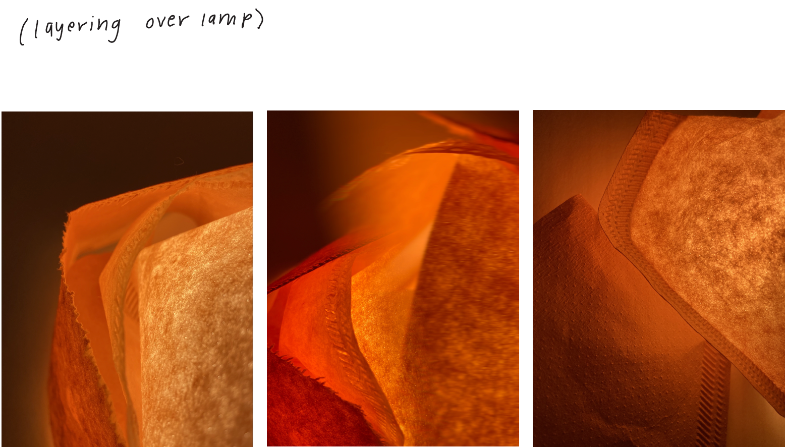
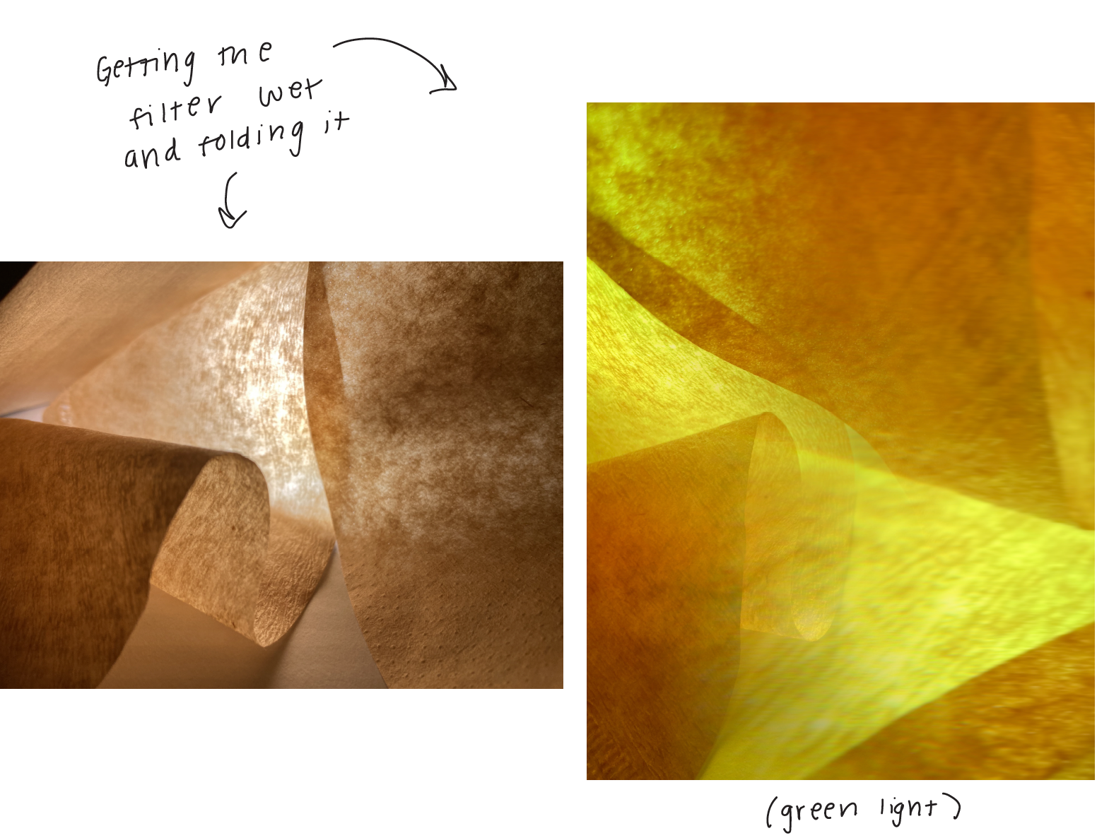
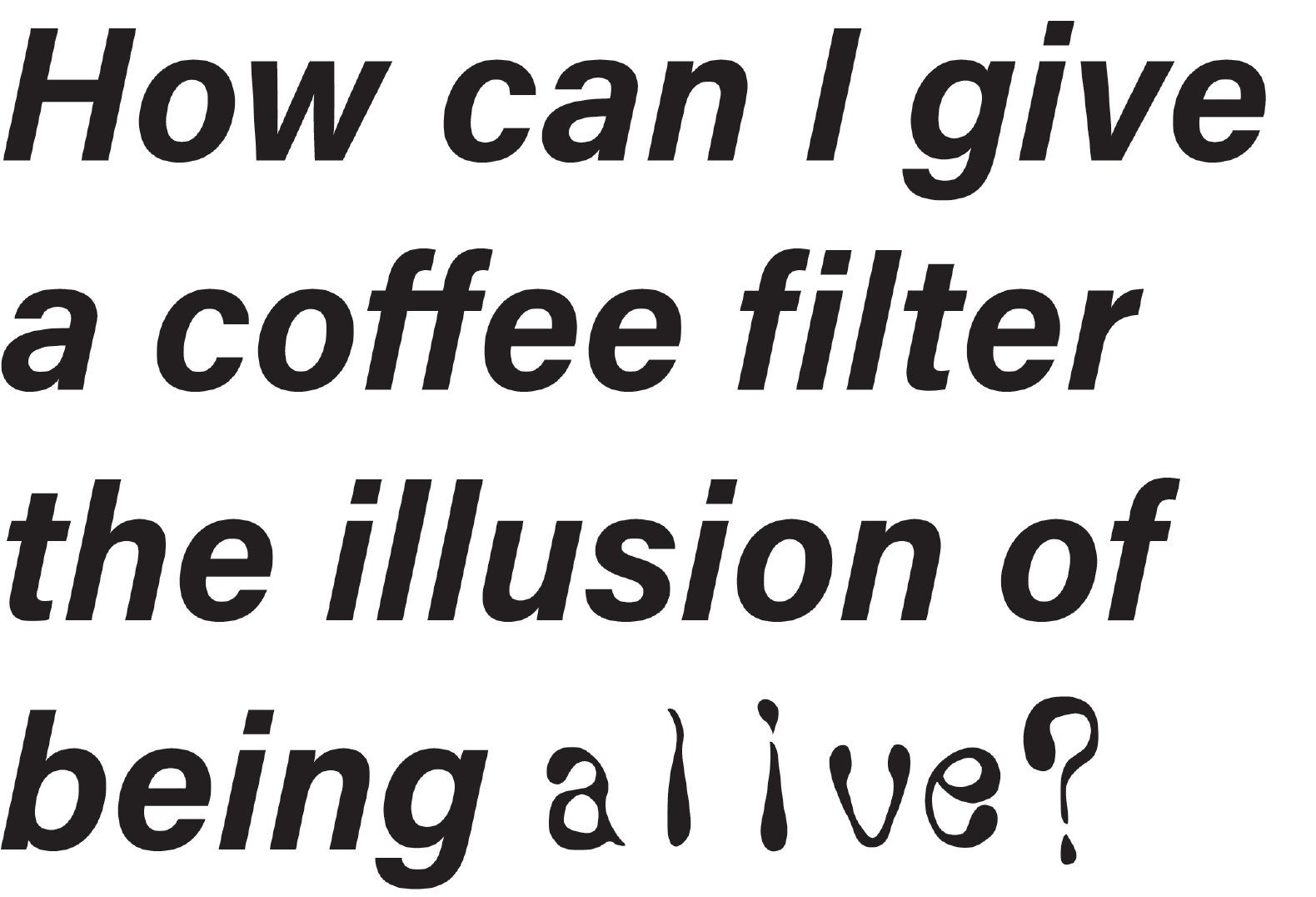
It started with a question: How can I make a coffee filter come to life? These 9 studies of the form, texture, transparency, and mechanics of a coffee filter may be transformed in various ways in order to appear living. All images are unedited, colors are attained through the use of a colored light. My conclusion was that the transformation of the coffee filter from dry to wet, static to dynamic, and opaque to transparent allows it to become alive. This particular case study pushed me creatively in a way that no other design project has in the past, and reaffirmed my belief in combining digital design with hands-on prototyping to enhance my skills as a designer.
THE PROCESS:
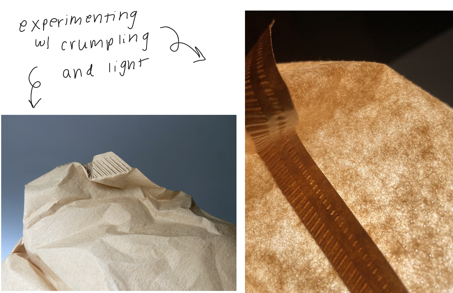
In order to push my exploration as far as possible and track my progress, I documented every aspect of my process. below is a collection of notes, experiments, and behind-the-scenes images, many of which did not make the final cut, but I feel are important to include in order to showcase my process as a designer.
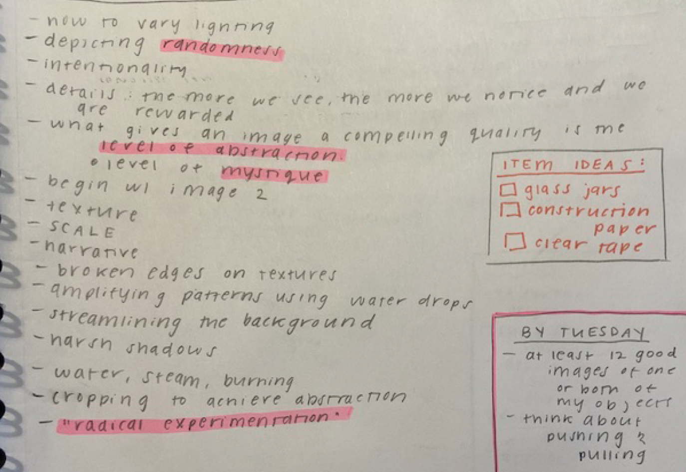
Outlining my goals
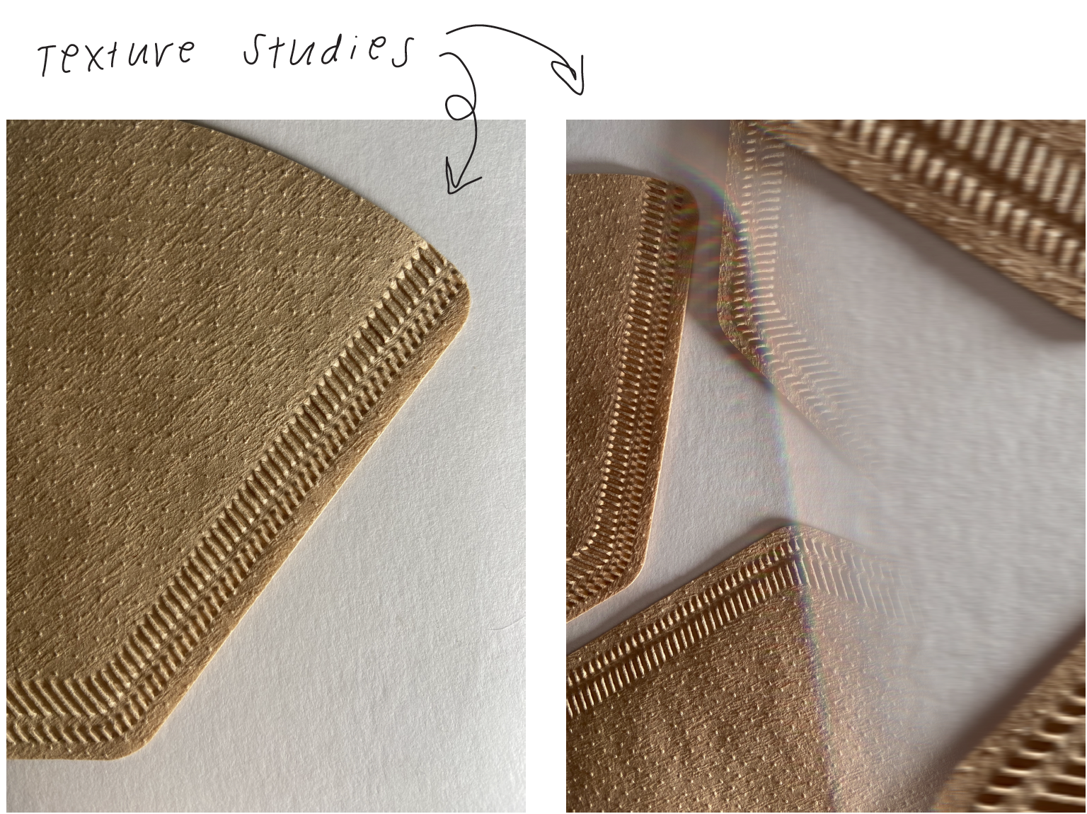
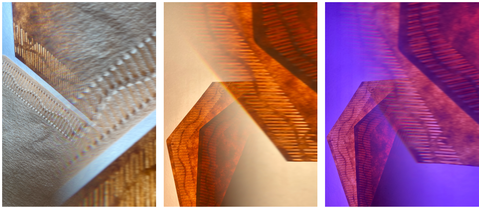
Texture studies
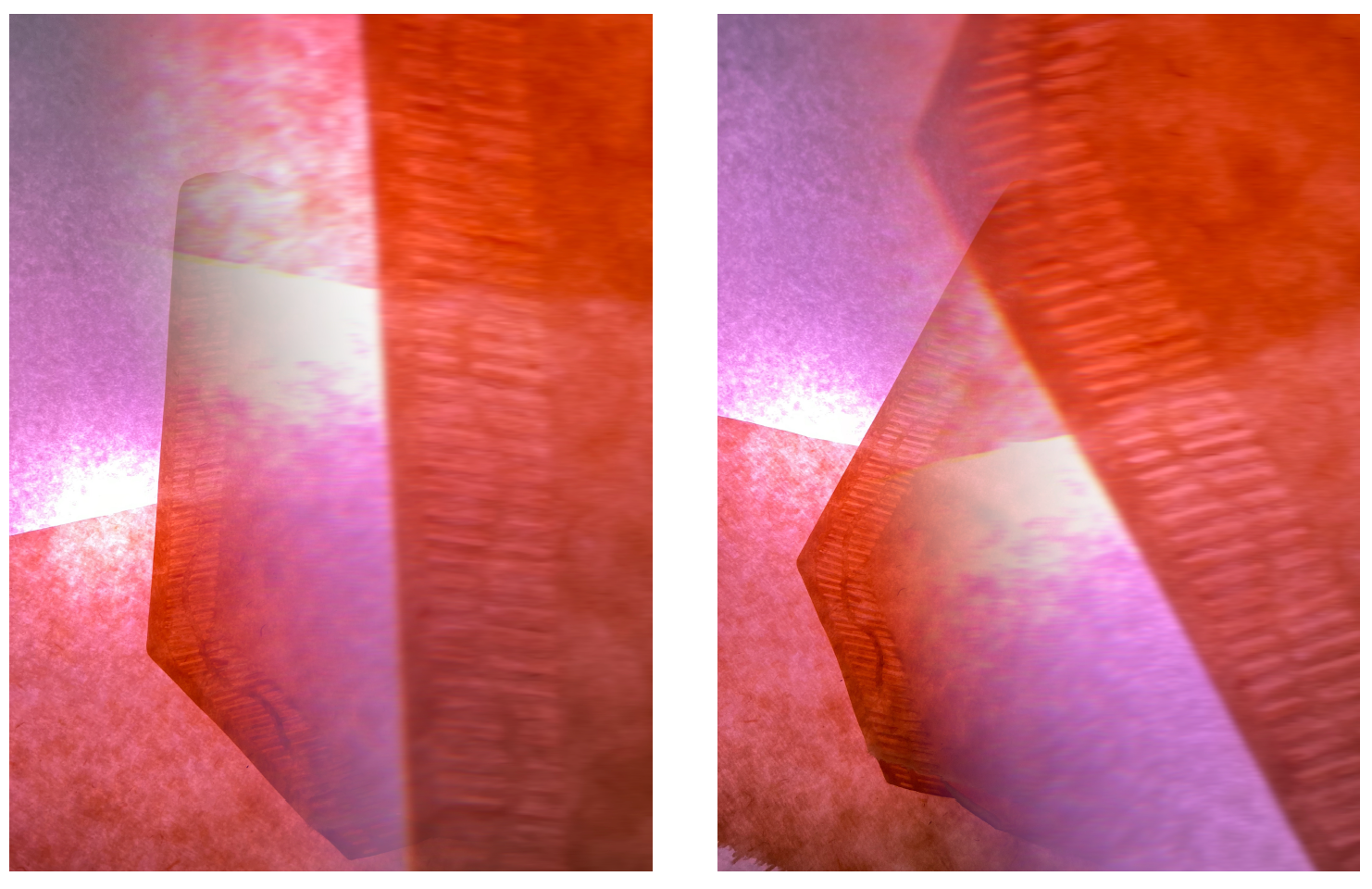
Layering dry coffee filter on top of posterboard, lit from behind
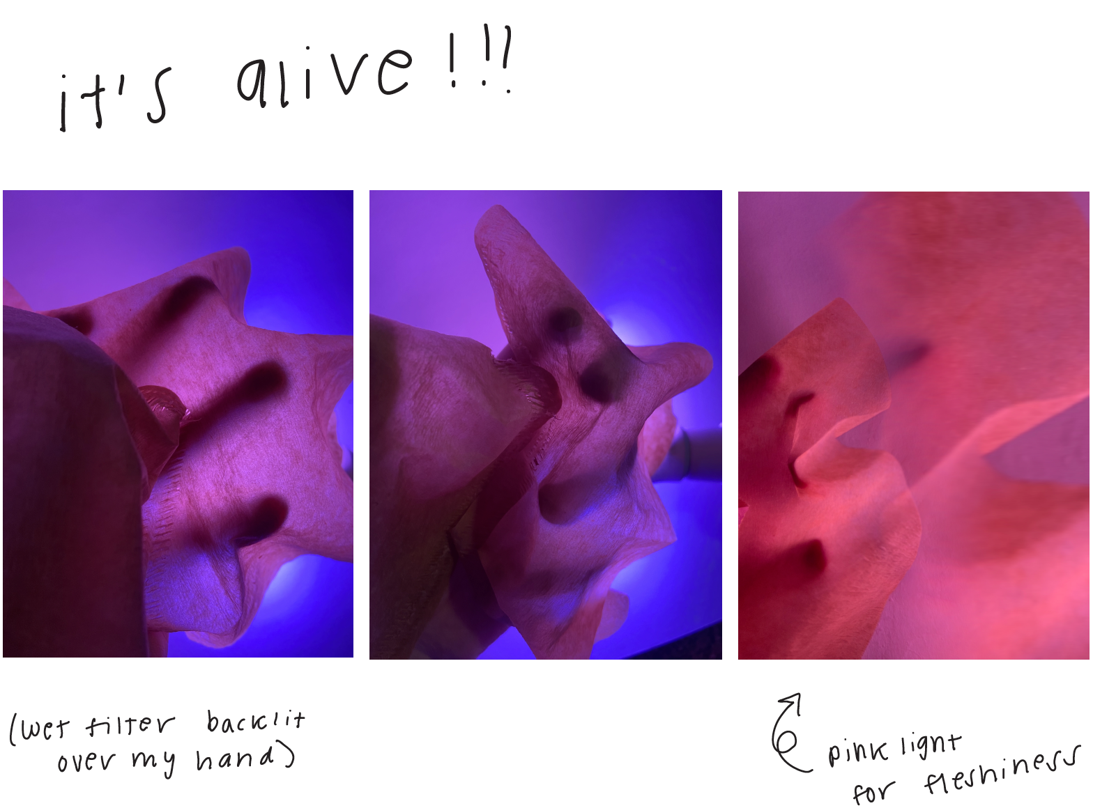
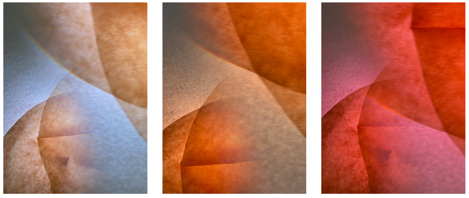
Damp coffee filters on top of posterboard, lit from behind, reminded me of cells
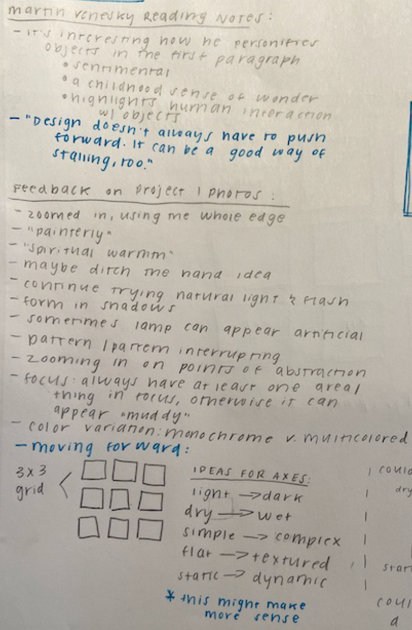
Research & Notetaking
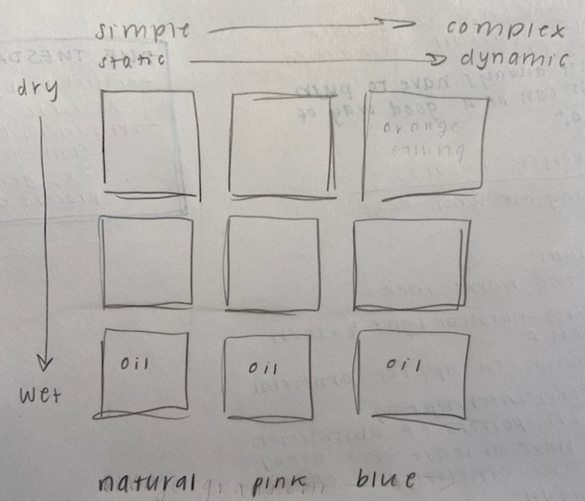
Organizing my results
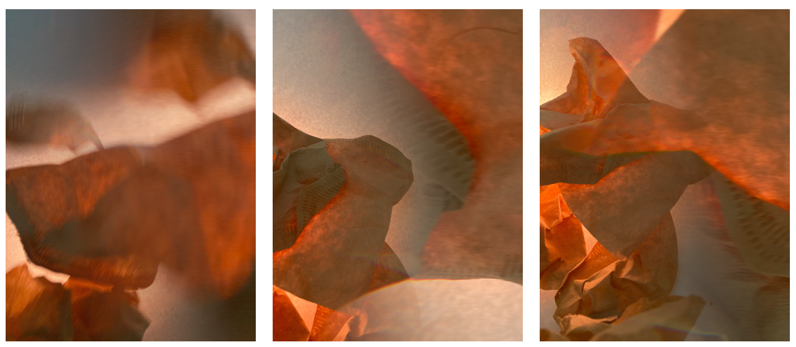
Playing with movement and light
ITERATIONS: This project had perhaps the most iterations of any design project I have worked on. Hundreds of images pared down into a final 3x3 grid.
The final grid. I chose to arrange my images in the following way: horizontally, the first row contains images of a dry filter, then damp, then submerged in water and oil. Vertically, I grouped images by the color of the light. The images also become more dynamic moving from top to bottom, due to the way that the coffee filter transforms when in contact with water.
